Pages

Friday, 15 November 2013

Arrr! A treasure map in Chem. Eur. J.!

Avast, me hearties! If there be one thing true 'bout academic journals, it is that there be not enough pirates involved. But lucky for us landlubbers, Chem. Eur. J. has put that to right with their latest cover. A treasure map! Aye and what a beauty she be.

This here map plots us a route well travelled by many. From the heart of that great land Europe, out to the wilds of the new colonies in the USA. I don't recommend using this depiction for your explorations though, the USA seems to have moved to where Africa traditionally lies. Nevertheless a great adventure it must be and anyway the map was charted by chemists not sailors.

The real excitement, as any good buccaneer knows, is of course in the hunt for treasure. This map takes us from a bislactim-ether, across the daring seas towards the final goal of tRNA. Along the way an unusual array of sea monsters present themselves, no sharks, krakens or even an octacoss, but instead those pesky amino acid intermediates and tRNA precursors. A healthy display of obstacles to overcome that only the bravest should attempt and which make any great journey even more rewarding. I can only hope that this discovery opened up chests full of funding for these fortune hunters...

But whatever happened to those great experimentalists of the seven seas, why are they all confined to landlocked labs nowadays? How do you think Blackbeard kept away all the grey hairs for so long? He was one of the first eminent colour chemists. Why do you think pirates were so obsessed with gold? They were all seafaring alchemists. What about the wooden legs and fondness for parrots? Well, some of them liked to branch out into prosthetics and zoology of course.

The Paper: The synthesis of Methylated, Phosphorylated, and Phosphonated 3'-Aminoacyl-tRNAsec Mimics
Found at: Chem. Eur. J. 2013, 19, 15872-15878

A new synthetic route is mapped out by this transatlantic team. The group wished to probe the enzymatic mechanism for the biosynthesis of selenocysteine (sec), which is the only amino acid to be synthesized on its related transfer RNA (tRNA). They prepared complex tRNAsec mimics that were methylated, phosphorylated and phosphonated, with an important amide bond from the ribose moiety that is crucially hydrolysis-resistant. The team wanted to develop these stable structures to gain more insight into the catalytic mechanism for the formation of selenocysteine by methods such as X-ray crystallography.

I'm sure much rum was consumed on the way to creating this little gem but the actual paper has absolutely no mention of buried treasure or pirates at all. The only map they use is 4-dimethylaminopyridine (DMAP), very disappointing indeed. Arr!

Thursday, 31 October 2013

The walking viral-microbial-fungal dead

I've just finished watching the first season of "The Walking Dead", yes I know, where have I been, there are already 4 seasons so hey no spoilers everyone. But what a series it is! Exciting stuff and I can't wait to spend another 12 hours today getting through the 2nd season.

The zombies will be amongst us once more for this year's Halloween. Tonight will bring the rise of pasty white faces, fake blood and calls for "braaaaains". Thankfully, not the actual flesh eating, party spoiling type but more the we like to get our drunk on kind. But what is it that makes those guys on The Walking Dead so antisocial?

The last two episodes of the first season gave us a big insight into the science behind the zombification that has plagued the world. The team end up at the Centre for Disease Control (CDC) where Dr Jenner is the last scientist standing. He seems to have a pretty neat set-up with voice activated computers and a top notch lab. So good is his equipment that through a standard bench top microscope he can see DNA. Yes DNA, that stuff in everyone's cells that is only a few billionths of a millimetre thick. Wow, I only wish I had access to that kind of kit. He later shows the other guys a video of Test Subject 19, with the "MRI virtual camera" and we see the brain activity dying out and coming back before he shoots a bullet through the patient's head. He fired a gun in an MRI machine! That could not have done the equipment much good, no wonder they hadn't made much progress.

Despite the cutting edge work that was obviously possible at the CDC, Dr Jenner admitted that they didn't really know anything. "It could microbial, viral, parasitic, fungal ... or the wrath of god!" Well, from the earlier microscope view I'd put my money on viral. Other (real) viral diseases like HIV and influenza are so difficult to treat due to the complicated nature of how they attack cells and mutations constantly altering them. Viruses are of course not treatable with common antibiotics and without proper hospitals available the infection will no doubt kill you fairly quickly. Luckily for us, in a "real" zombie attack, all that rotting flesh would fall prey to Nature's excellent ability to clean up the dead.

These scenes really made me laugh out loud. A nice attempt by the show to bring some actual science to it that was maybe lacking but maybe not needed. Always fun to see them try though and can only be a good thing for making people aware of current (more likely far in the future) technology and that in an apocalypse science is still very important. Also if you want to do research whilst the world is ending, then go to France, apparently those guys can last the longest.

Thursday, 10 October 2013

The PhD that was

After having submitted my thesis last week, I thought it time to retire the PhD page from my blog. So here it is for posterity...

I had the pleasure of working with Dr Bruce Turnbull at Leeds. My project was to develop general strategies towards controlling protein self-assembly into designed nanostructures.

Taking advantage of weak protein-carbohydrate interactions we aim to construct three-dimensional nanoscale virus-like particles and other nanoarchitecture (my new favourite word). Ligands of various lengths, and with different carbohydrate moieties of varying affinity, have been covalently attached to the cholera toxin B‑pentamer (CTB). The carbohydrate units bind into the natural binding pocket of another CTB pentamer, bringing the proteins together to form different aggregates and particles. Analysis of the structures can be performed with AUC, MS, AFM, SEC, ITC, DLS and any other acronym you can think of.

PhD strategy


So what does it all mean?

Well, to simplify things just imagine a brick. Now stick some velcro to that brick. Then get a load of these in a bag, shake them about a bit and hopefully out should pop a discrete spherical object. If this sounds unlikely and a bit crazy then you've grasped the idea perfectly.

If we can build organised, controlled structures on the nanoscale then this opens up possibilities for nanomachines, templated reactions and drug delivery vehicles.

PhD life

Doing a PhD is stressful, hard work and immensely fun. The work differs day to day with massive highs when your reactions unexpectedly work and terrible lows when your proteins commit suicide. There is a lot of self-motivation and commitment needed to complete a successful PhD, and it also helps having a great team around you and a kind word of encouragement every now and then (cheers Bruce). All for the advancement of the human race, and maybe also for the title of Dr before your name.

Turnbull lab group
 

Sunday, 25 August 2013

Dalí makes it into Nature Chemical Biology

Wow, just wow. Nature Chemical Biology has done it. Yes they have published the most bizarre and surreal image ever to be unleashed on a journal front cover.

Dali Nature Chemical Biology
Dream caused by neuronal decay

Salvador Dalí could never have imagined that one day his work would feature in such a prominent place for an artist of his stature. He could not have thought this in his wildest dreams, and he did have some pretty wild dreams. The image takes inspiration from 3 of his famous paintings, the first being "Dream caused by the flight of a bee around a pomegranate a second before awakening". Well, there are no pomegranates here but we do have a tiger leaping out of the sky and clamping its jaw around a neuron. Pretty cool and not quite as confusing as the pomegranate, fish, tiger, tiger, gun sequence from the original painting. The melting clock in the foreground is of course from Dalí's "The persistence of memory", its presence here probably a sad reflection that Huntington's disease can affect many people early in their lives. And finally the trees in the background come from "The three sphinxes of bikini". They are meant to symbolise the mushroom cloud of an atomic bomb in the original painting and so here gives another hint to the deadly nature of the disease. Not really much fun here after all.

I like that Nature Chem Bio does give you a little peak into what the authors were smoking when they made the image. The tiger apparently is meant to show the "difference in proteostasis mechanisms" which determines the "longevity of a neuron". Hence why our tiger is trying to eat that giant neuron.

No tigers were harmed during the making of this cover

The Paper: Proteostasis of polyglutamine varies among neurons and predicts neurodegeneration
Found at: Nature Chemical Biology, 2013, 9, 586-592

The paper is a study on the huntingtin toxin, a protein that causes Huntington's disease. The level of glutamine residues in the toxin can vary and it is this variation that leads to the protein misfolding and causing the disease. The larger polyglutamine regions were important as they also reduced the lifetime of the toxin. It was found that different neurons cleared the huntingtin toxin at different rates, with cortical neurons acting quicker than striatal neurons and thus living longer. They concluded that the biological pathways and in particular the Nrf2 pathway, responsible for protein degradation would be good targets for therapeutics for treating misfolded protein diseases. So maybe some good news in the end.

Friday, 9 August 2013

Geek week communication

It is geek week on Youtube and so I thought as science falls firmly into this category I'd highlight a few short videos I'd class as great science communication. They are all quite different and show the variety of things possible in front of a camera. I wrote a post not long ago about how words are important for communication, but of course that is not the only medium available for telling your story. Videos can be a great source of information and far more appealing in some cases. 

The complex life of sugars

This film was made for the Royal Society Summer Science exhibition that took place in London earlier in July. It's a nice whizz through all the areas of normal life where carbohydrates are found. The graphics are amazing, it keeps things very simple from tree bark to microarrays. Importantly also, the chemical structures are accurately shown which is unfortunately not always the case in popular science.


Conference call

The second film is a discussion of what is synthetic biology and where is it going. The film was produced at a conference of the Synthetic Components Network and nicely combines interviews, discussions and fancy images of proteins. Make sure you pay attention at 1.30 for a cameo appearance from yours truly. As a finger is pointed towards my poster, Beth Bromley says, "...they have no idea of what's impossible". Thanks Beth.


An extreme sport

The third video here might have been just a bit of fun, but it is really fantastic and a great example of how anyone with a camera can make an exciting and engaging short film (about chemistry!). I bet you've never seen a camera on a rotavap before...


For more great science videos have a look at Kyle Hill's round up for Scientific American and of course for all the ladies out there I couldn't write this post without mentioning the amazing awful "science: it's a girl thing".

Thursday, 25 July 2013

Conference tweeting


At the recent International Symposium on Macrocyclic and Supramolecular Chemistry conference (ISMSC8) there was a distinct lack of interactions through social media.

Whilst coffee breaks and poster sessions were full of interesting chats and discussions, the internet was almost completely ignored by the attendees. The ISMSC website encouraged the use of the hashtag #ISMSC before the conference began. But in the book of abstracts and throughout the conference there was no mention at all of Twitter, I was disappointed.

There were a couple tweets in the build up before the conference, giving hope of a social (media) bunch of people.


But during the conference I found myself a little lonely with only Ivan Aprahamian and Guillaume De Bo really contributing. Ivan summed up the twitter experience calling the crowd "technologically challenged".


With sponsorship from Nature Chemistry and the National Science Foundation, both pretty big in Twitterland, you might have expected some input from them. But alas no, it was left to Chem Comm to join us at the end to publicise the poster prize they were sponsoring.


Another chemistry conference, ISACS11 is taking place this week with around 50 tweets just from yesterday, although mostly dominated by one Chemistry World journalist. Whilst this is not a huge amount it is still much better than at ISMSC8. Derek Lowe is also present and so he's busy blogging through some of the talks.

But what is going on here? Is it just a generation difference and the young folks need to step up or are some conferences missing a trick? Get the discussions going over some coffee sure, but continue it and spread it further on the internet.

Tuesday, 18 June 2013

My first conference talk

The chemistry postgraduate conference was at Leeds last week and I gave my first ever proper conference talk. Being in the last couple months of my PhD and therefore extra busy, extra stressed and with no time for distractions like these silly presentations, I left things to the last minute.

So it was only an internal meeting and the audience mostly made up of other postgrads from the organic section, but speaking to a full room is never an easy task.

The build up

A hash together of group meeting slides and figures from previous reports gave me something to practice in front of the lab group, with 3 days to go. I tend to think I am quite good at winging it and this is generally my theory for life, but in this case it wasn't great. I realised this was kind of a big deal and therefore I should put a bit of effort in. Therefore next couple days were spent creating ChemDraw schemes, making cartoon figures and in 3 hour meetings with my supervisor.

presentation slideAthene Donald wrote a great blog post about the pitfalls of conference presentations, with the key point being practice, practice, practice! I can only agree with her. I also got a handy tip from my supervisor to make sure it started well. he suggested that I learnt a script for the first couple slides of introduction so that I knew exactly what to say at the beginning and wouldn't stumble through incomprehensible mumbles.

Amazingly, it all went rather well. I knew what I wanted to say and said it. I spoke confidently and even managed to get a couple small laughs in, thankfully no tumbleweed moments. I handled some probing questions, avoiding anything too deep on the synthesis or too general on the reasons (applications are overrated). Shown above is one of my slides giving the (one day) infamous cartoon depiction of the cholera toxin protein, everyone knows that it's red right? In our lab, every protein has its own colour.

And relax

My talk was the last one of the day, a potentially awful slot if everyone is fed up by then and itching to get to the wine reception. But it was nice afterwards to not have to sit through any more pretending to listen whilst going over my notes. I had some great feedback from friends and academics and then got in to the bitching about some of the other talks.

Blue background and then blue data points on a graph, bad idea. Switching to a second presentation because you left out or forgot to talk about something, bad idea. Talking in a voice so deep you make the floor vibrate, bad idea (maybe I'm just jealous about not having a deep manly voice for this point).

I now know what to expect next time around and what to do better. I'll always remember this as a first effort and maybe with some feeling of nostalgia. The conference was followed by a ball in the evening that was also a memorable event, or not so for those of us overindulging in the free wine.

Tuesday, 21 May 2013

What am I on about?

Seriously, what on earth am I going on about?

When trying to get your point across, have a debate or tell a story it is very important to say the right words. Communication is all about language and used well can be an incredibly powerful tool.

First some common words

I wanted to have a look at the language I've been using on this blog and see if I'm saying the right things or in fact (more likely) saying some very strange things. I thought that a quick trip over to Wordle, a nice website for making fancy word displays, could tell me what I wanted to know. The 75 most frequently used words from my last 10 blog posts are displayed below.

blog wordle

The most obvious and bizarre thing is that I apparently say first an awful lot! I say first more than any other word. Why? I don't see second in the wordle. Maybe I don't think second is important. Maybe I get so distracted with the first thing that I ramble on and then start talking about other questions like oh look questions is pretty big on the picture too.

Science is up there, journal, work, cover (I do talk about covers a lot) but there are other surprising big ones such as one. When do I say one? Am I talking about unique occurrences or again get bored after the first? I'd like to see more superlatives being used. Great is there, but I have much better words than that in my vocabulary. I think science is wonderful and we should use equally wonderful words to describe the amazing world we live in.

There's no point doing ground breaking work and not telling anyone about it and that's where words come in. Language can not only be useful but also fun. Playing around with your split infinitives can allow you to boldly go where no scientist has gone before.

Saturday, 11 May 2013

Birthday celebrations

This week is my birthday. Woohoo! I'm now into my late 20s, one step closer to death...

Birthday covers

To celebrate my constant loss of brain cells and the failure of my DNA to replicate properly, I thought I'd have a look at another big birthday that happened this year. My favourite journal, Angewandte Chemie, celebrated 125 years of publication.

To celebrate the occasion a gathering of the great and the good was held in Berlin earlier this year. Backs were patted and many nice things were said, including a piece from Stuart Cantrill with some interesting trivia. The journal started as a magazine for industrial chemists published in German, the journal title itself translating as 'applied chemistry'. English readers had to wait until 1962. The journal has actually been going for 126 years but had a year off in 1946 due to the war. So with 125 years of published articles, the covers in January were fittingly congratulatory; fireworks and champagne all round. The Issue: Angew. Chem. Int. Ed. 2013, 52, 1-466  (notably open access).

Angewandte birthday fireworksAngewandte birthday drinks

The original cover

There really is a lot to celebrate for the guys at Angewandte. They've been at the forefront of the evolution of journals over the past 50 years especially. They were the first chemistry journal to introduce graphical abstracts and also the first journal to have pictures on the covers. Before this there was simply a list of featured articles and other journals at the time just started straight off with a table of contents.

The January issue in 1977 was a breakthrough. Scientists now had a platform to paint a picture worth a thousand words. Ok, they weren't as flamboyant as the fireworks quite yet, but a massive leap it must have been.

Angewandte first coverThe paper: Experimental Electron Densities and Chemical Bonding
Found at: Angew. Chem. Int. Ed. Engl. 16, 32-40, 1977

Taking a look at that first cover, all I can say is, wow! What on earth is going on there? To start with, it's in black and white (colour wasn't invented until 1986). A pretty simple picture compared with today's outings but pretty intriguing for a first attempt. There are some contours which suggests an energy landscape with peaks between the, presumably, atoms of C, C and N.

The paper is all about electron densities and quite frankly is way out of my field. But I was right with the contour map, so go me! Taken out of the paper the caption for the image states, "Deformation density in the plane of the three-membered ring of 2,3:5,6-bisepimino-p-benzoquinone at 143 K." Well that certainly clears everything up.

As we've seen, things have moved along significantly. There have also been a few surprises along the way, a humorous cover from 1987 used cartoon acrobats to demonstrate radical chemistry. Perhaps Angewandte should also be congratulated as the original place for TOC ROFL.

Friday, 26 April 2013

Chemical poetry

This week on Twitter has been all about Real Time Chem, if you've somehow missed it then you are spending too much time in the lab.


Real Time Chem is a great community project on Twitter using the hashtag #RealTimeChem. Chemists all over the world have been sharing their daily experiences, lab work, cool articles and finding solace in the fact that they are not the only one failing to purify that unknown black mess.

Amongst other things this week, I have been doing some isothermal titration calorimetry (ITC). A wonderful technique (when it works) of measuring the binding enthalpies and association constants for non-covalent interactions. It's one of my favourite pieces of kit to use; it can give great insight into the success (or failure) of synthesised ligands and makes some pretty graphs.

ITC machine
ITC results


After setting the experiment going I had about 30 minutes to procrastinate before the run was finished. So the internet gets fired up and through a strange connection of aimless link clicking, on websites including "Facebook", "Chemistry World" and "Jet2 cheap flights" (possibly not in that order), I came across Nobel prize winner Roald Hoffmann. Whilst obviously being a great scientist, Professor Hoffmann is also the author of a large number of poems. Some of his work focuses on chemistry and I thought what a fantastic medium poetry is for expressing the wonder and excitement of uncovering nature. I'm sure it would work equally well for portraying the torment and anguish at failed reactions, but let's stick to the wonder for now.

Back at the ITC, a flash of inspiration hit me and I came up with a poem all about the technique...


Isothermal Titration Calorimetry

Separate they contemplate their lives alone
But this the only thought they share
Not knowing their worlds are about to collide
Never loneliness will they again bear

One passively waits for an injection of life
Floating in their own little cell
The other poised to mix at the first chance
That stirring sensation will tell

But it takes another to set their paths
One who knows what makes them attract
To turn up the temperature, wait for the calm
Push the right buttons, see them interact

An initial touch, not sure where it will lead
At first you can never quite know
But a second feel, a larger reach
The heat given off starts to show

As if they had always been as one
They're together and will never part
The creator watches his successful work
Plotting their lives as a chart

Their story lives on for others to see
An example for anyone that looks
To find a guest for that elusive host
Written down in the wisest of books

Saturday, 20 April 2013

Imaginary elements

It's time to sit back and relax. Put your feet up and put on a good film... oh here comes some actual chemistry, a surprising rarity in sci-fi. Oh and it's totally inaccurate, excellent. 

#ChemMovieCarnival

As part of the "chemistry at the movies" blog carnival hosted by @SeeArrOh I'm going to look at a film that split viewers into lovers and haters. Avatar. An epic sci-fi and a basic remake of every other struggle of good vs evil, but with a huge budget and in 3D. So obviously, I thought it was awesome.

The film's premise is based on chemistry. Well at least it is based on the hunt for a new resource, a new mineral, a new element, whatever it is they give it an interesting name; unobtanium. Since Mendeleev put together the world's most famous piece of furniture, chemists have been working to fill in the gaps and add on to the end. So where does unobtanium fit on our nice little table?

Unobtanium?!
Well it doesn't really fit anywhere, it's not real. But being not a real element is not a problem. The fictional element dilithium in Star Trek and the alloy carbonite in Star Wars have both become cult favourites and their use in the films is totally acceptable. The only problem that I have with the fictional unobtanium, is its name. The people at the Resources Development Administration must have used up all the hardtofindium and long ago depleted their stocks of wishwehadmoreofthisium. They had to get their hands on a new super element. James Cameron in his wisdom came up with a totally implausible name that no sane scientist would give to such a sought after material. It's this stupid name that in my opinion lets down an otherwise flawless film...

(What? There are body swapping giant blue aliens and floating mountains? That's totally fine.)

Other appearances

Unobtanium has actually made it to the movies before. In The Core, it was used to build their ship. A scientist in the film gives us a small insight into its composition, he "combined the chemicals in a tungsten titanium matrix", hmm.

The name has also been in use by engineers since the 1950s, according to trusty Wikipedia. So these films really could have put in a bit more effort to come up with something that sounded more sciencey. The tradition now is to name it after the discoverer or institute or a famous scientist, so what was wrong with Pandorium or (an egotistical and possibly worse) Cameronium. Despite being completely silly, unobtanium can still take its rightful place on the periodic table of imaginary elements (I have this poster on my wall), with other beauties such as dalekanium and crapcrapium.

For more Chem Movie Carnival fun follow the hashtag or have a look at this summary. I'd highly recommend the synthesis of kryptonite and how to poison a nitrogen based life form.


claimtoken-51752d618549d

Tuesday, 2 April 2013

The Octacoss!

The Octacoss is upon us! Run for your lives... A recent cover from OBC introduces the latest terror to be unearthed from the depths of the seven scientific seas.

Watch out the Octacoss is about

The Octacoss
This new monster is staring with unblinking eyes, piercing the soul of any unsuspecting readers. But you'd soon forgive him any harm done, as he is rather cute.

The little pink guy is wrapping his far-reaching tentacles around a number of useful objects found lying on the bed of any well stocked laboratory sea. Coral dendrimers; often showing fascinating fractal patterns which may increase the tentacle's reach. Starfish labels; not the usual prey of our 8-legged friends and so instead used undoubtedly as a tool (perhaps a ninja throwing star). Anchor linkers; holding the beast in place and catching any passersby hook, line and sinker.

Boldly displayed on his chest, the creature is showing off a rather geeky tattoo. A chemical schematic of a silsesquioxane with the 8 branches shooting off down his 8 tentacles. The artists have given a wonderfully fun, if not overly dramatic representation of their cubic structure. However, we should now be considering whether a journal cover is the right place to show such ridiculous images. As other academics are likely to be the only people viewing it, will it interest them? There are not many chances for this kind of expression in a field that is often overly serious about itself and so in my opinion, yes, why not have a bit of fun. It's big, it's bold, it's a little bit silly, but it definitely draws you in and it sent me looking up what these silsesquithingys are all about.

Putting the Octa in Octacoss

The Paper: Bioconjugation on cube-octameric silsesquioxanes
Found at: Org. Biomol. Chem., 2013, 11, 2224-2236

The article is a review of recent advances in the modification of these highly symmetric structures. COSS are cube-octameric silsesquioxanes, therefore OCTACOSS are octa cube-octameric silsesquioxanes. The authors seem to have developed an all too common case of RAS syndrome.

It is the biochemical elements in this review that make it stand out (as well as the delightful octopus). COSS are not particularly new structures having first been synthesised in 1955. But the functionalisation and recent biological applications are importantly highlighted.

The high stability and low toxicity of the core structures is discussed in the article. Particular attention is then paid by the authors to the bioconjugation and self-assembly of glycoclusters for studying lectin binding and the use of dendrimer constructs for drug delivery. The review finishes with an analysis of the "most advanced application" of COSS scaffolds as molecular probes. A decent review overall, covering a wide range of uses for a not so monstrous creation.

Sunday, 24 March 2013

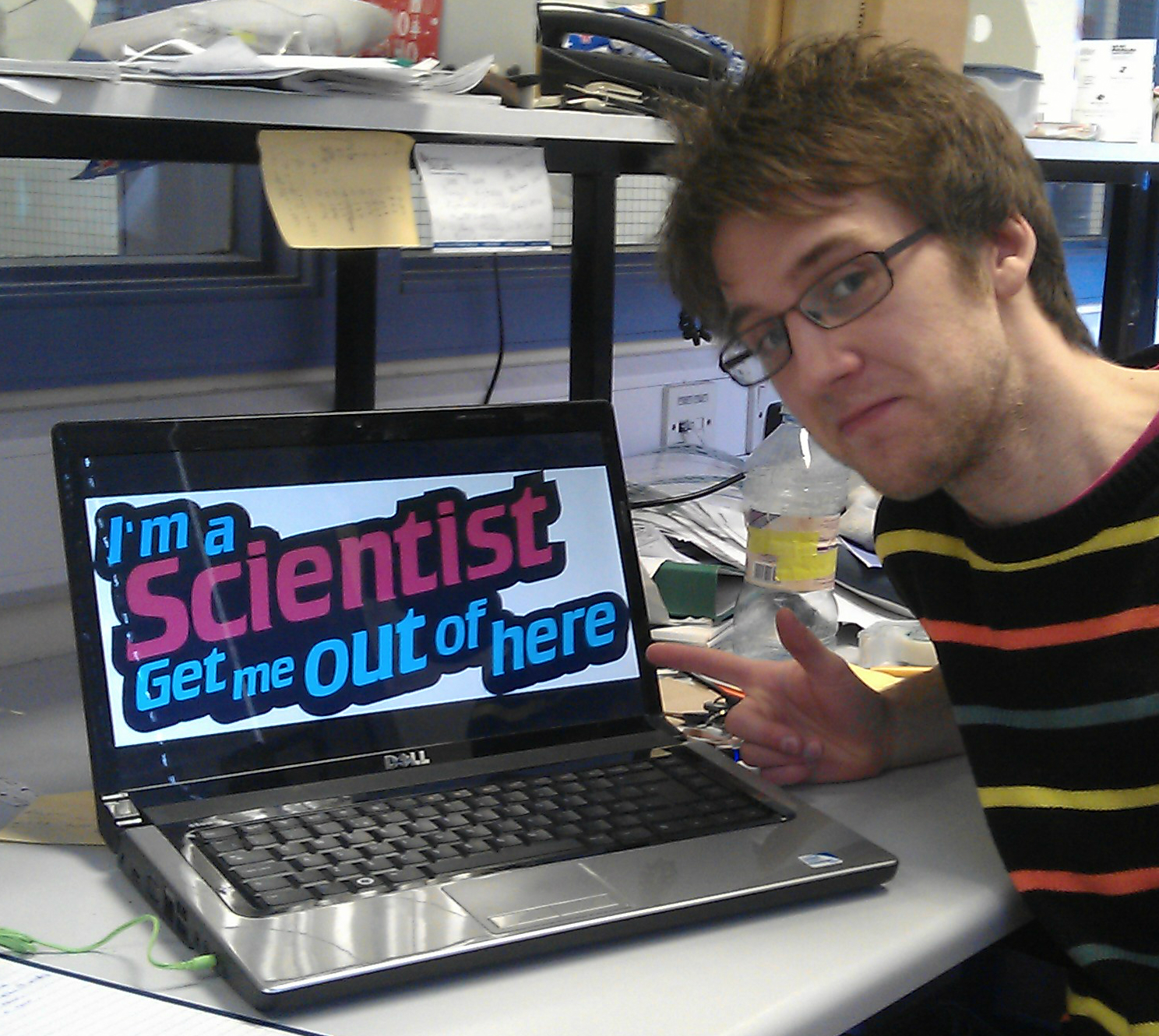
Get me out of here!

What a great couple of weeks it's been and finally I now have a chance to rest. My fingers are aching from typing so much and my brain hurts from puzzling over hundreds of queries. After participating in "I'm a scientist, get me out of here", was it all worthwhile?

The gloves are off

The first week started as a bit of fun, chatting to some kids and quite simply being amazed by the variation of questions that kept popping up on the screen. As the second week began however, things started to get a little more serious.

The fairly sedate pace of the first week saw 3 live chat sessions spread out over the 5 days. By comparison, at the end of the second Tuesday another 4 chat sessions were done. And the end of Tuesday meant it was time for the first eviction. It was Jon that fell at the first hurdle. He admitted that his demise was probably attributed to missing that day's chats due to work. The loss of a fellow scientist made the event suddenly all so real. Could I afford to miss a question so I had time to purify some protein? Could I afford to delay purifying some protein so I had time to answer more questions?

Get me out of hereWednesday saw the loss of Yalda. We had all been in the chats, we had all been quick to get a share of the all important (or not so) first response to questions posted online. So what had made the difference this time? No eye contact in her profile picture was the best suggestion I heard. Did the students want short, straight answers, did they want some humour? Was a question as a reply the best way to engage them, or would a detailed essay be preferred? My guess was a good mix of it all and that's what I went for, although not the easiest thing to pull off.

4 chats were scheduled for Thursday; it was going to be a busy day. The culmination was an exchange with an all girls school, that included arguments over animal testing and inquiries into how many children we all wanted. This may have been the deciding factor of why Claire was next to leave.

So, I was in the final! It was now just me and a fellow PhD student Jack. I was so relieved to have made it through to the end. But after coming so far, my only thoughts were now on the win. Jack obviously felt the same, with some (fairly light) fighting talk on Twitter.

The winner of the Drug Development zone is...

After 2 weeks of grilling the scientists, asking questions that they either never dared or never had the chance to in normal classes and actually getting to know the scientists with some (sometimes too) personal questions, the winners were undoubtedly the students. What a fantastic event it has been, with great credit of course going to the organisers and moderators who kept everything running smoothly. Hopefully I have played some small part in sparking the students' interest in science and maybe even hooking a few in for life.

The results of the all the zones were announced one by one in the "staffroom" on the website, with many of the nervous scientists then expressing their joy and congratulations to their peers. After finishing off the nails on all my fingers, the Drug Development zone was the last to be declared. Jack and I had made that final push for the student votes, there were no more questions to answer and no more opinions to sway. The votes were counted. It was a tie! Equal votes, both winners. A wonderful end to a brilliant event. We congratulated each other and now both have the chance to use the £500 prize for further outreach events. So again, the real winners are the students.

The scheme is running again in June and I would highly recommend it to anyone wanting to get experience explaining theories and concepts to a different audience or just wanting a break from talking to their boring old professor.

Sunday, 17 March 2013

I'm a scientist...

After a week of struggling to answer mind-bending questions and not pass out in manic live chats, I've come to the conclusion that 13 year-olds are actually a fairly intelligent and extremely inquisitive bunch.

Like X factor for scientists

I'm a scientistI was picked to be part of the national on-line event "I'm a scientist, get me out of here"! It's an excellent initiative run 3 times a year, where school kids can literally ask a scientist anything they want.

The event has been running for a few years and this March they have 11 zones each with 25 school classes, which means a lot of kids to contend with. The places for scientists were 6 times oversubscribed and this time they have added more zones in an attempt to accommodate more schools. It's popular, but why?

I've been involved in outreach programs before. I've helped out at Uni open days and demonstrated experiments for school kids coming in. A year ago I took part in (the now defunct) Researchers in Residence, where I went into a year 11 class for a number of weeks. During this time I talked to them about my work, arranged for a trip for them into university and naturally tried to encourage them all to become scientists. These schemes were great at showing children a human side to science and allowing them to see what a university and an actual "scientist" are really like. This is where I'm a scientist excels.

The kids get to post questions on the website and then bombard us with yet more in the live chats. Most so far are real science queries with most of them based on drugs (me being in the Drug Development zone). The real novelty of this project however, is that in the following week I may be kicked out. Every day the children will vote for their favourite scientist out of our group of 5; who answered their questions best, who sounded most intelligent or simply who told the best joke. At the end of each day one will leave and by Friday only one will remain victorious held aloft by their teenybopper fans.

Hello why do you like science

So the kids can connect with scientists and ask all the questions they never get to in their normal science lessons. But as I said, not all of the questions are sciencey. The others include gems such as, "waffles or pancakes?" and "how tall are you?". But these questions are equally important as they allow the scientists to become real, human people. We are not a bunch of deranged lab rats nor are we an elitist, higher intelligence (even if I'd like to think so sometimes). Connecting with the school children through these silly questions lets them see us for what we really are; just like them. With this in mind, hopefully they will realise that science is for them and in a few years they'll be the ones changing the world and inspiring the next generation.

As for me, I'm thoroughly enjoying the experience. I've answered all the questions I could and even answered some that I had no idea about before. My enthusiasm for science and engagement has rocketed and my lab work has suffered immensely. But with my supervisor away this next week I may get a little obsessed answering questions and reading ones from the different zones, that is unless I get evicted...

Friday, 1 March 2013

Posting a winning formula

Last week the Masters students in Leeds presented posters on their work as part of their degree course. For the few weeks beforehand (yes it took them a few weeks) they were mostly hidden away behind a computer changing fonts, images, headings and references until they had something resembling a five-year-old's first attempts at potato printing.

Winning is not so blue and white

After a little bit of tweaking, arguments over font size and drastically changing the colour scheme, the butterfly finally emerged from its chrysalis. But no, they were not actually all that bad, especially for a first attempt. Few people realise how difficult it is to make something scientifically accurate and also visually stimulating.

As an example, below are 2 posters that came out of my lab from PhD students. So which do you think won a prize when presented at a conference?

Better poster?
Best poster?


To put you out of your misery, the answer is both. Both designs won best poster awards at different meetings. But they are obviously quite different. Nature Journal believes a good poster could "change your career", so what is the secret formula for success?

Well in my opinion the poster on the left looks a lot better. It has more colour, lots of different images, not much writing and easy to follow sections for different parts of the presentation. But I would say all this, as I created it. By contrast, the poster on the right has a lot of small writing, it's very white and appears overly crowded. But they both were winners.

They both do have many images and diagrams, they both have a fair amount of data presented and they are both blue, not so different as it might first seem. A poster has to be eye-catching in some way or at least grab your attention for long enough so that you read a few lines and get hooked. From then on in it has to be ordered, easily understood, not overloaded with information and with a few pretty pictures thrown in for good measure.

The designer of the right poster is also one of the best talkers that I know. She can talk about anything and make it sound interesting (even her research). And this is a great skill that you can't show on a piece of paper. Being able to verbally communicate with your audience, to not confuse them or bore them, is vital. Knowing your audience and being able to change the language you use and the way you describe things can really make the difference. This might be between someone just saying hi to be polite as they quickly walk past, or being drawn in by a few well chosen words.

Teacher knows best

So back to the masters students. It took me a lot of effort to convince one student that brown and pink perhaps didn't make the most pleasing of background colours. The text was cut down by half; no one wants to stand there for an hour reading. We removed the empty white space by increasing image sizes and rearranging text boxes. And I even got my name squeezed into the acknowledgements. But I did fail to make him increase the font size, even after much pleading and threatening to sabotage his work. It was perfectly readable on the computer screen, but when printed and up on a large stand he admitted that you probably get a better view if you don't have to stand with your face 10 cm from the board.

Being bold and confident in your abilities is great. And in the end you have to be comfortable with what you've produced otherwise you won't be able to talk about it effectively. But one thing I've learned over the last few years, is that I don't always know best (many will be amazed to hear me say this). Take advantage of any help you can get. Use other people's knowledge. Seek a different opinion. Do this and you will better yourself. I never thought poster design could be so philosophical.

Sunday, 24 February 2013

Macro Letters "cool cover"

The relatively new ACS Macro Letters journal has joined Twitter ("finally", I hear you all call out)! Their 3rd ever tweet boldly publicises, "The cool cover for the sample Jan '13 issue". So let's see just how cool it is...

Cool. adjective, 1. moderately cold

Macro Letters cool coverThe cover image for the first edition of 2013 really does stand out, but is it for being cool? Simple, is maybe the biggest compliment I could give it. Old fashioned, boring, forgettable are perhaps more fitting descriptions. Perhaps the editors had inadvertently left their first paper copy in the fridge and so were just commenting on how it was now at a fairly low temperature. Different journals do often distinguish between articles with catchy names, such as Chemical Science's "edge articles" and Angewandte's "hot papers". Using these definitions does lead to a distinction between papers in the same journal and is in part an (successful?) attempt to bring modern and exciting language into a sometimes dry, emotionless academic world.

But leaving behind this first attempt to reach out into the hip and trendy world of twittering, let's dissect the imagery...

Separated into four pictures, the bright colours and ambiguity of the images at least attracted my curiosity as to what this is all meant to mean. Some nice regular pattern going on at the top left with a close up at bottom right. The always fashionable brown shading, favoured by eccentric physicists, indicating an AFM image. In the top right corner we have a mold pressing in to a surface or perhaps a representation of some complimentary interactions? I'm a big fan of simple cartoons, but a little context would be nice. And finally at the bottom left we have some actual science with a cross-linked polymer structure that can possibly rotate. This piece of the puzzle confirms the polymeric patterning idea, although it would have been good of them to choose slightly nicer ChemDraw settings.

The January issues of ACS Macro Letters are open access, a rare and potentially lucrative way of attracting a new readership. But this also puts more of an emphasis on first impressions and therefore the cover. A great opportunity then to show off some eye-catching, "cool" scientific artwork. Opportunity missed I fear for this year.

Reversible covalent bonds

The paper: Thermally Induced Nanoimprinting of Biodegradable Polycarbonates Using Dynamic Covalent Cross-Links

The actual science is not too bad at all. Copolymers are produced with furanyl and maleimido side chains which can undergo a Diels-Alder reaction at an elevated temperature of 130 °C. This process cross-links the polymer, giving it an increased rigidity. They use a nanoimprinting method to put a pattern into the polymer film at the high temperature and then when cooled down the design stays put. The effect is reversible, as when the temperature is increased once more the side chains break apart and, in the absence of a mold, will form new unstructured bonds with no overall shape on the macroscale. A simple and nicely demonstrated idea.

Sunday, 10 February 2013

Nano Star Wars

The first cover from the past to make the list is a blockbuster from Angewandte Chemie.

Nano Star Wars AngewandteThe Force is strong with this one

The Death Star is being attacked by the Rebel Alliance which appears to be using its new range of hydrazine based spacecraft. Eye-catching and certain to draw attention as the cover is based on an already iconic image.

An A-wing hydrazine ship (not the Rebels' best) can be upgraded to an X-wing (the pride of their fleet) by the simple addition of nickel ions. Now why didn’t Admiral Ackbar think of this earlier? Armed with these ion blasters the hydrazine ships swoop down into the Empire’s stronghold reacting with the innocent platinum nanoparticles imprisoned within.

An interesting analogy here, which begs the question of whether the authors have actually seen Star Wars. But nevertheless a smart reimagining of a classic tale. Personally however, I think I’ll stick to the original for my film of choice.

Science-fiction to science-fact

The paper: Highly Active Nanoreactors: Nanomaterial Encapsulation Based on Confined Catalysis
Found at: Angew.Chem. Int. Ed. 2012, 51, 3877–3882 

Things may seem more exciting when high powered laser beams are being used, but reality is often no less interesting. Back on Earth, the research presented here does illustrate the use of nanoreactors for confined and controlled catalysis. Hydrazine reduces the nickel ions and the encapsulated platinum nanoparticles catalyse the formation of metallic nickel. The hollow, porous silica nanocapsules provide the perfect environment for a confined reaction, allowing dynamic exchange of the reagents without loss of catalytic activity.

With nanoparticles forming nanocapsules as nanoreactors enclosing nanocrystals for the production of nanomaterials, this paper surely deserves the prize for the most excessive use of the prefix nano.

Friday, 1 February 2013

Cover Art

Science is art

At first glance, academic journals may seem to be all seriousness and impersonal facts. But at the very front of every edition lies an artistic outpouring. The cover is the place for scientists to highlight their work and at the same time show off their skills with Photoshop.

Here, researchers have a chance to show off the essence and ingenuity of their fantastic work, or so they hope. Creativity, imagination and communication are core principles of art and design. These same attributes are also vital in science.

Many journal covers have caught my eye over first few years of my fledgling academic career and so here I shall promote some of the best (and worst) examples. The scientists deserve some recognition for what they have produced after hours slaving away, perfecting their art.

The importance of cover art

There is a certain prestige to having your work plastered on the front a shiny little book. However, with the movement to electronic editions with fewer people ever seeing a paper copy and therefore not starting from the cover, have they lost significance? In the last 3 years I can count on one hand how many paper journals I’ve flicked through. It is far more normal now to jump straight to a pdf of the specific article you are searching for. Altmetric investigated this further with discussion in a recent blog post.

Cover Art Science magazineAt The University of Leeds we have a common room that has cover art from the latest publications by Leeds academics posted around the walls. And whether these images have helped gain funding, entice the smartest undergrad or simply aroused the interest of a lost history student, there is a certain something to them that is worth talking about.

Bringing scientific information to life

The cover of Science this month exemplifies the importance of this art. It showed the winning illustration in the 2012 “Science NSF International Science & Engineering Visualization Challenge”. A stunning image of a “wiring-diagram”, which represented long-distance neural connections in the brain of a macaque. The outcome was that the visualisation could provide guidance for forming a brain-like network from multiple computer chips.

Science magazine is found at: Science2013, 339, 6119, 481-616

The goal of the competition is nicely stated as,
"to encourage new ways to visualize data ... for conveying scientific principles and ideas across disciplines and to the general public, and for revealing the hidden beauty of structures on scales from nanometres to the cosmos."
Fun, informative and about monkeys (sort of), what more could you want?